Tired of standard design portfolios?
Forget the project dumps and step into my shoes. Dive into a lively story of turning post-startup chaos into clean UI architecture, owning end-to-end product design, and navigating real-world collaboration.

Prologue: The Primordial Soup
It all started with a brilliant idea.
Every day, kids are flooded with harmful digital garbage. The company founder saw a solution in smart AI filters. Blocking toxic content on the fly.
This concept sounds perfect to me: protecting the kids, fighting the chaos.
Four products grew from that single idea. The company covered B2C (family protection), B2B (schools and organizations), and even B2G (tools for the police to catch online predators) sectors in USA, Israel and worldwide.
Product A (B2C)
Product B (B2G)
Product C (B2C & B2B)
Product D (B2B)
Like in most startups, reality couldn't keep up with ambition. Speed was the absolute priority. The designer lived in an endless sprint: hand off a design, immediately grab the next task. There was simply no time to stop, take a breath, and plan the file structure or lay the foundation of a design system.
Chaos grew strictly by the laws of thermodynamics—and sometimes even faster.
Without design tokens, the designer simply created new elements from scratch. Without a style library, every update had slightly different text styles. Without a defined color palette, corporate colors were picked "by eye," missing the right shade every time.
Without a palette: color shades multiply.
Soon, the interface looked like a primordial soup. Slightly mutated elements from past updates floated around, surrounded by completely random spacing. The front-end developers, feeling this total mess with their fingertips, naturally lost all respect for the designs. They started hardcoding their own spacing and text styles.
When the problem was finally realized, the point of no return had passed. Cascade of quick patches rooted so deep into the code that fixing the situation would require an earthquake.
Without a style library: text styles breed like rabbits
Realizing the Problem, or My Predecessor’s Zen
What I saw when I first opened the working files made me wonder about the mysteries of human nature.
The file system for all four products was a complete knot. Files with meaningless names were dropped into random folders. A design for Product A might easily live in the folder for Product B. The file name was beautifully short: "last edit". It was last opened three years ago.
Zooming in, I saw that the designs were mostly just screenshots of the old UI. New features were casually slapped right on top.
A component library simply did not exist. Basic tools of modern civilization, like Auto Layout, were completely ignored. Design mockups were built using the harsh Photoshop testaments of the early 2000s.
Without a component library: "designing" meant slapping new features onto old screenshots
A button was just a rectangle. The text floated on top as a separate layer. Centered strictly "by eye", of course.
The madness didn't stop there. Nested groups went deep into infinity. If you try try to drag a button, half of it stays in place, but somehow, text from Group 2241 and a table from Group 5246 from the other side of the artboard moves. Copying a simple object was physically impossible.
Without file architecture: simple updates turn into a nightmare
Looking at all this, I wondered: if everything in the universe naturally moves toward chaos, is there any point fighting it? Clearly, the previous designer had reached a state of true Zen to be able to work in these conditions.
I had a wonderful Product Manager. She realized the scale of the disaster. And she knew our current sprint was packed with product tasks—not to mention the daily emergencies. Her advice was highly philosophical: "Just handle what you can in the background. Maybe something will work out after all."
(Spoiler: It actually did.)
BEFORE
AFTER. With design system and clear architecture: the entire user experience improves.
Act I. Foundation: Cleaning the Augean Stables
Like Hercules, I rolled up my sleeves and got to work. Design refactoring became my default strategic goal—even though zero official time was booked for it. I was supposed to tackle it in my "free time". But a solo Product Designer managing four products in a fast-paced startup doesn't ever have free time.
So, I started a guerrilla war for consistency.
First, I created Design Library files for each product. Every grain of certainty, every valid element I could isolate from the chaos, was carefully saved there. While working on regular product updates, I quietly extracted Assets and built Components on the side.
Design Library: preserving every grain of certainty
My second move was reverse-engineering. I went to the developers, got the stylesheet for each product, and pulled out everything I could. I saved these as Styles and Variables in the new library, strictly syncing my naming with the devs' code. In my case, the live code was the only Source of Truth.
Reverse-engineering: live code was the only Source of Truth
I linked this library to every new file. If something was missing, I refused to hardcode it. Instead, I added it to the library—even if it cost me my lunch break. Step by step, I rebuilt the design tokens based on the live products.
I hunted for the gold standard among the Franken-components, speeding up the process with plugins like html.to.design. Still, proper Auto Layout and flawless responsiveness had to be done by hand.
At the same time, I showed the developers how similar features across different products could share a single common template. That’s how cross-product tokens were born. It was a long process of merging—not an immediate change.
Crafting design tokens with Auto Layout for seamless work experience
Cleaning up the files turned out to be even harder. The root of the problem was the company's evolution. Our products were slowly merging, and their features overlapped. As a result, the exact same feature—with minor visual tweaks—was scattered across different Figma projects. Chaos was multiplying.
The solution had to be radical. I proposed merging three separate projects into one. Now, every file has a strict label (🟪 C / 🟦 N / 🟩 R — matching the product’s corporate color and first letter) to show where it belongs. Cross-product features no longer spawn in random folders. They live peacefully in a single file, neatly organized across different pages.
Cross-product features now live peacefully in a single file, just on different pages.
The architecture was set. But then I hit the legacy of Jira tasks.
Strategic tasks had lingered there for years, hard-linked to ancient mockups. Deleting an old Figma file meant destroying corporate history. I had to keep everything. After a serious consultation with AI, I started digging.
The routine was almost meditative. Open a nameless file. Figure out what it is. Give it a human name. Put it on the right shelf.
Then the restoration began. I carefully rebuilt the current live design versions based on the design system tokens. This fresh, precise mockup went on the very top page. It became the shiny front door and the file's thumbnail. Along the way, I opened Jira tickets—because I needed a legal way to fix the glaring visual bugs already living in production.
Current live design version rebuilt based on design system tokens
Just beneath this shiny facade, on the lower floors, the untouchable historical legacy rested in peace.
Hopelessly outdated files and duplicates met a different fate. They weren't deleted. They were sent into an honorable exile: the Archive. Now, their top page displayed a massive, bright sticky note linking to the new consolidated mockup.
The result: old links survived, and my inner perfectionist was satisfied.
Historical legacy: resting in peace on lower pages
Act II. Product Forefront: The End-to-End Design
I was to develop a new feature called Overall Daily Limit. It was meant to help users cut down on screen time and build better digital habits. Smiling inside, I started the classic routine:
1. Competitive Analysis & Brainstorming
I studied the competitors and, with every passing minute, fell deeper in love with our future tool.
Competitive Analysis & Brainstorming
2. The Sweet Prelude
I savored the scale of the task. Sketched on paper. Stared out the window. Stayed mysteriously silent during lunch. In short, I projected the aura of a True Creative.
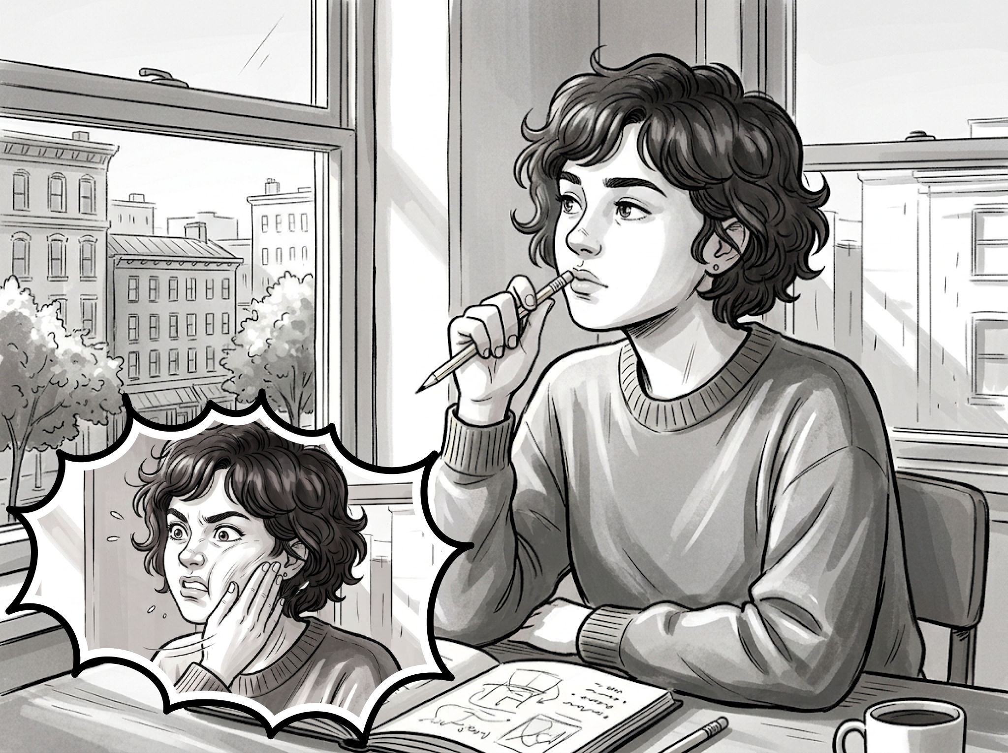
And here’s my senior-level method to stop visualizing and start working...
3. From Dreams to Doing
I gathered the relevant components already living in production—no need to reinvent the wheel.
Consulted the developers. Drafted functional wireframes. No visual polish – pure function. Thanks to design tokens, even raw wireframes automatically inherited the corporate style.
And just as everything confidently built to a culmination—surprise! The team kicked off a new sprint. Priorities changed. The Overall Daily Limit feature was shelved...
First drafts
In its place, a new task landed on my desk: a massive, unreadable wall of text for the Onboarding process.
I took a deep breath. Called AI for backup. Sliced the text monolith into a sane, step-by-step user flow, practicing UX Writing along the way.
Then, my hard-won design system took the stage. I grabbed ready-made tokens and instantly assembled a functional prototype, spending zero time on wireframes. There it was: the first dividends of a well-ordered house.
The text monolith transformed into a step-by-step user flow
Meanwhile, a final Go/No-Go meeting took place for another feature.
A massive one, touching three products at once.
Getting this release to the finish line had required a series of diplomatic missions across four departments. The goal? Pin down the algorithm's expected logic. As it turned out, every single specialist held a deeply personal and entirely unique vision of how it should work. The Product Manager and I gently wove them all together.
Pinning down the filtration algorithm's logic required a series of diplomatic missions across four departments
And so—the final review. The moment of truth. Everyone is gathered. The design was approved, the code was written, and it was ready to launch.
"But why do we even need this?" one stakeholder asks with genuine curiosity.
The tension in the room shatters into a collective roar of laughter. Total, unconditional acceptance of human nature.
A massive feature, touching three products at once
Act III. Human Forefront: The Art of Compromise
Sketch 1
Joining a long-established company as a newcomer is like marrying a widower with five kids. The household routine is set, habits and expectations are baked in, and people react to the ghost of your predecessor rather than to you...
I send an approved chatbot design to the developer. It is pixel-perfect, complete with a detailed brief in Jira.
A couple of weeks later, I spot something live in the app—bypassing all QA stages entirely.
Me, turning to Developer A.:
— What is this new chatbot design on the site?
— Oh, I made that.
— … Did you see the Jira ticket? There was a fully detailed design mockup approved at every level.
— Yeah, but I thought it would look prettier this way. :)
Reaching a design compromise
If that doesn't make you feel the futility of existence, what will?
This is where you have to stand your ground, but keep your ego out of the room. I kept an open mind, extracted the best out of the teammate's initiative, and used his takeaways to make the final design even better.
After giving the colleague's opinion its due respect, I still insisted on a precise QA check.
Design QA
Sketch 2
I crafted pixel-perfect mockups just to obediently return to patching up old screenshots for another rushed MVP. The actual front-end implementation? Highly selective. Always the path of least resistance.
This is where soft skills saved the day. I would quietly sneak over to a developer's desk and gently ask them to tweak a few values directly in the open code, bypassing ticket bureaucracy entirely. Really quick live adjustments, under my careful supervision.
Yes, it was a tiny guerrilla action, but for the good. There was no other way. Entire generations of flawless mockups had already fallen in the unequal battle against urgent trivialities, buried forever in the Jira graveyard.
Front-end implementation: always the path of least resistance
Epilogue: A Survival Formula
Almost every design job description demands the "ability to work under pressure."
A line or two down, they invariably ask for "creativity."
But no employer ever warns you about the blonde at the next desk. I never figured out her actual job title. From morning till night, she chatted loudly and passionately with her neighbor. Top-tier noise-canceling headphones surrendered in disgrace. Her cheerful laughter made the windowpanes rattle.
The takeaway was obvious. True creativity happens at 5 AM, from the quiet of home. In those blessed hours when the kids, the husband, and every single coworker are guaranteed to be silent.
And that is how I formulated my three ultimate boosters for professional creativity: discipline, mutual respect, and a hybrid work model.
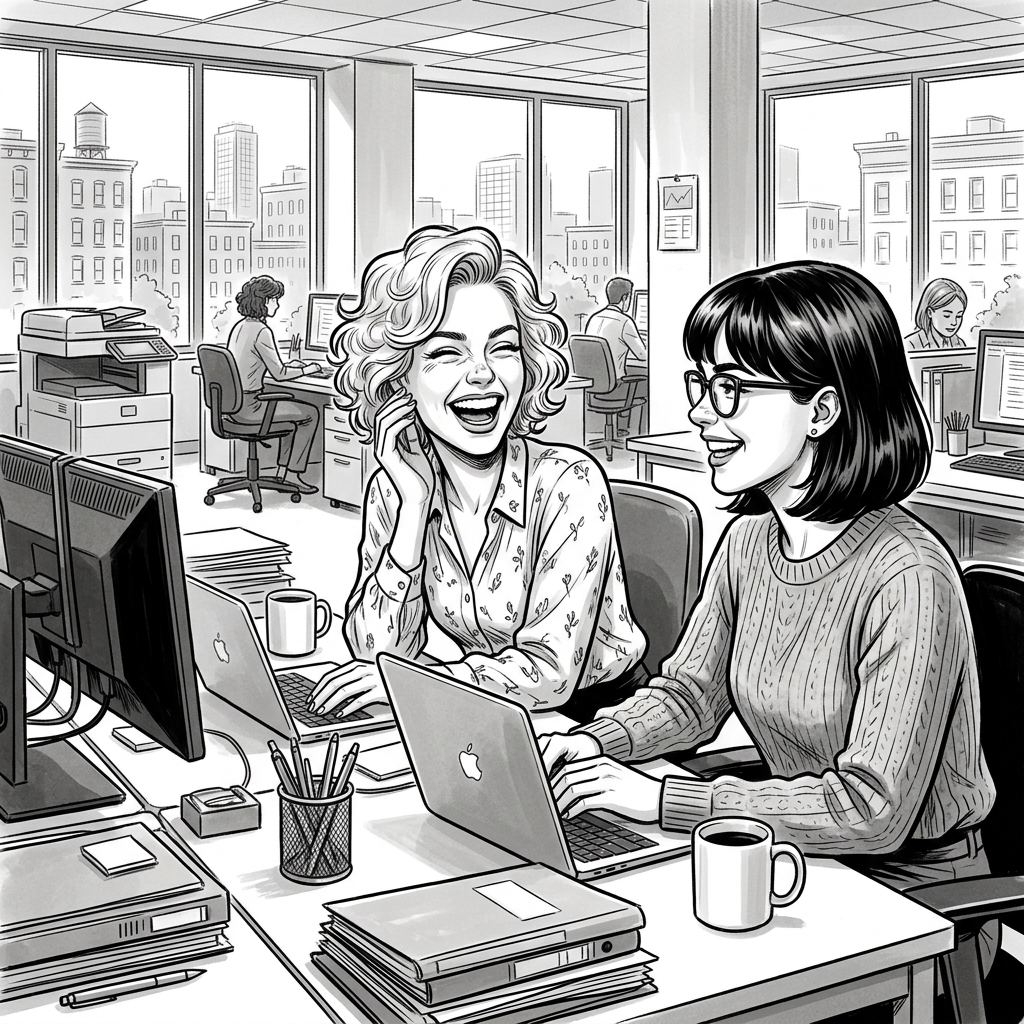
“Survive” ©
Are you still here? Thanks for reading!


Tired of standard design portfolios?
Forget the project dumps and step into my shoes. Dive into a lively story of turning post-startup chaos into clean UI architecture, owning end-to-end product design, and navigating real-world collaboration.


Solo on Figma. A Play in Three Acts
Polina Livshitz Product Designer
Prologue: The Primordial Soup

It all started with a brilliant idea.
Every day, kids are flooded with harmful digital garbage. The company founder saw a solution in smart AI filters. Blocking toxic content on the fly.
This concept sounds perfect to me: protecting the kids, fighting the chaos.
Four products grew from that single idea. The company covered B2C (family protection), B2B (schools and organizations), and even B2G (tools for the police to catch online predators) sectors in USA, Israel and worldwide.
Product A (B2C)
Product B (B2G)
Product C (B2C & B2B)
Product D (B2B)
Without a palette: color shades multiply.
Like in most startups, reality couldn't keep up with ambition. Speed was the absolute priority. The designer lived in an endless sprint: hand off a design, immediately grab the next task. There was simply no time to stop, take a breath, and plan the file structure or lay the foundation of a design system.
Chaos grew strictly by the laws of thermodynamics—and sometimes even faster.
Without design tokens, the designer simply created new elements from scratch. Without a style library, every update had slightly different text styles. Without a defined color palette, corporate colors were picked "by eye," missing the right shade every time.
Soon, the interface looked like a primordial soup. Slightly mutated elements from past updates floated around, surrounded by completely random spacing. The front-end developers, feeling this total mess with their fingertips, naturally lost all respect for the designs. They started hardcoding their own spacing and text styles.
When the problem was finally realized, the point of no return had passed. Cascade of quick patches rooted so deep into the code that fixing the situation would require an earthquake.
Without a style library: text styles breed like rabbits
Realizing the Problem, or My Predecessor’s Zen

Without a component library: "designing" meant slapping new features onto old screenshots
What I saw when I first opened the working files made me wonder about the mysteries of human nature.
The file system for all four products was a complete knot. Files with meaningless names were dropped into random folders. A design for Product A might easily live in the folder for Product B. The file name was beautifully short: "last edit". It was last opened three years ago.
Zooming in, I saw that the designs were mostly just screenshots of the old UI. New features were casually slapped right on top.
A component library simply did not exist. Basic tools of modern civilization, like Auto Layout, were completely ignored. Design mockups were built using the harsh Photoshop testaments of the early 2000s.
A button was just a rectangle. The text floated on top as a separate layer. Centered strictly "by eye", of course.
The madness didn't stop there. Nested groups went deep into infinity. If you try try to drag a button, half of it stays in place, but somehow, text from Group 2241 and a table from Group 5246 from the other side of the artboard moves. Copying a simple object was physically impossible.
Without file architecture: simple updates turn into a nightmare
Looking at all this, I wondered: if everything in the universe naturally moves toward chaos, is there any point fighting it? Clearly, the previous designer had reached a state of true Zen to be able to work in these conditions.
I had a wonderful Product Manager. She realized the scale of the disaster. And she knew our current sprint was packed with product tasks—not to mention the daily emergencies. Her advice was highly philosophical: "Just handle what you can in the background. Maybe something will work out after all."
(Spoiler: It actually did.)
BEFORE

AFTER. With design system and clear architecture: the entire user experience improves.
Act I. Foundation: Cleaning the Augean Stables

Like Hercules, I rolled up my sleeves and got to work. Design refactoring became my default strategic goal—even though zero official time was booked for it. I was supposed to tackle it in my "free time". But a solo Product Designer managing four products in a fast-paced startup doesn't ever have free time.
So, I started a guerrilla war for consistency.
First, I created Design Library files for each product. Every grain of certainty, every valid element I could isolate from the chaos, was carefully saved there. While working on regular product updates, I quietly extracted Assets and built Components on the side.
Design Library: preserving every grain of certainty
Reverse-engineering: live code was the only Source of Truth
My second move was reverse-engineering. I went to the developers, got the stylesheet for each product, and pulled out everything I could. I saved these as Styles and Variables in the new library, strictly syncing my naming with the devs' code. In my case, the live code was the only Source of Truth.
I linked this library to every new file. If something was missing, I refused to hardcode it. Instead, I added it to the library—even if it cost me my lunch break. Step by step, I rebuilt the design tokens based on the live products.
I hunted for the gold standard among the Franken-components, speeding up the process with plugins like html.to.design. Still, proper Auto Layout and flawless responsiveness had to be done by hand.
At the same time, I showed the developers how similar features across different products could share a single common template. That’s how cross-product tokens were born. It was a long process of merging—not an immediate change.
Crafting design tokens with Auto Layout for seamless work experience
Cross-product features now live peacefully in a single file, just on different pages.
Cleaning up the files turned out to be even harder. The root of the problem was the company's evolution. Our products were slowly merging, and their features overlapped. As a result, the exact same feature—with minor visual tweaks—was scattered across different Figma projects. Chaos was multiplying.
The solution had to be radical. I proposed merging three separate projects into one. Now, every file has a strict label (🟪 C / 🟦 N / 🟩 R — matching the product’s corporate color and first letter) to show where it belongs. Cross-product features no longer spawn in random folders. They live peacefully in a single file, neatly organized across different pages.
The architecture was set. But then I hit the legacy of Jira tasks.
Strategic tasks had lingered there for years, hard-linked to ancient mockups. Deleting an old Figma file meant destroying corporate history. I had to keep everything. After a serious consultation with AI, I started digging.
The routine was almost meditative. Open a nameless file. Figure out what it is. Give it a human name. Put it on the right shelf.
Then the restoration began. I carefully rebuilt the current live design versions based on the design system tokens. This fresh, precise mockup went on the very top page. It became the shiny front door and the file's thumbnail. Along the way, I opened Jira tickets—because I needed a legal way to fix the glaring visual bugs already living in production.
Current live design version rebuilt based on design system tokens
Historical legacy: resting in peace on lower pages
Just beneath this shiny facade, on the lower floors, the untouchable historical legacy rested in peace.
Hopelessly outdated files and duplicates met a different fate. They weren't deleted. They were sent into an honorable exile: the Archive. Now, their top page displayed a massive, bright sticky note linking to the new consolidated mockup.
The result: old links survived, and my inner perfectionist was satisfied.
Act II. Product Forefront: The End-to-End Design

I was to develop a new feature called Overall Daily Limit. It was meant to help users cut down on screen time and build better digital habits. Smiling inside, I started the classic routine:
1. Competitive Analysis & Brainstorming
I studied the competitors and, with every passing minute, fell deeper in love with our future tool.
Competitive Analysis & Brainstorming
And here’s my senior-level method to stop visualizing and start working...
2. The Sweet Prelude
I savored the scale of the task. Sketched on paper. Stared out the window. Stayed mysteriously silent during lunch. In short, I projected the aura of a True Creative.
3. From Dreams to Doing
I gathered the relevant components already living in production—no need to reinvent the wheel.
Consulted the developers. Drafted functional wireframes. No visual polish – pure function. Thanks to design tokens, even raw wireframes automatically inherited the corporate style.
And just as everything confidently built to a culmination—surprise! The team kicked off a new sprint. Priorities changed. The Overall Daily Limit feature was shelved...
First drafts
The text monolith transformed into a step-by-step user flow
In its place, a new task landed on my desk: a massive, unreadable wall of text for the Onboarding process.
I took a deep breath. Called AI for backup. Sliced the text monolith into a sane, step-by-step user flow, practicing UX Writing along the way.
Then, my hard-won design system took the stage. I grabbed ready-made tokens and instantly assembled a functional prototype, spending zero time on wireframes. There it was: the first dividends of a well-ordered house.
Meanwhile, a final Go/No-Go meeting took place for another feature.
A massive one, touching three products at once.
Getting this release to the finish line had required a series of diplomatic missions across four departments. The goal? Pin down the algorithm's expected logic. As it turned out, every single specialist held a deeply personal and entirely unique vision of how it should work. The Product Manager and I gently wove them all together.
Pinning down the filtration algorithm's logic required a series of diplomatic missions across four departments
A massive feature, touching three products at once
And so—the final review. The moment of truth. Everyone is gathered. The design was approved, the code was written, and it was ready to launch.
"But why do we even need this?" one stakeholder asks with genuine curiosity.
The tension in the room shatters into a collective roar of laughter. Total, unconditional acceptance of human nature.
Act III. Human Forefront: The Art of Compromise

Sketch 1
Joining a long-established company as a newcomer is like marrying a widower with five kids. The household routine is set, habits and expectations are baked in, and people react to the ghost of your predecessor rather than to you...
I send an approved chatbot design to the developer. It is pixel-perfect, complete with a detailed brief in Jira.
A couple of weeks later, I spot something live in the app—bypassing all QA stages entirely.
Me, turning to Developer A.:
— What is this new chatbot design on the site?
— Oh, I made that.
— … Did you see the Jira ticket? There was a fully detailed design mockup approved at every level.
— Yeah, but I thought it would look prettier this way. :)
Reaching a design compromise
Design QA
If that doesn't make you feel the futility of existence, what will?
This is where you have to stand your ground, but keep your ego out of the room. I kept an open mind, extracted the best out of the teammate's initiative, and used his takeaways to make the final design even better.
After giving the colleague's opinion its due respect, I still insisted on a precise QA check.
Sketch 2
I crafted pixel-perfect mockups just to obediently return to patching up old screenshots for another rushed MVP. The actual front-end implementation? Highly selective. Always the path of least resistance.
This is where soft skills saved the day. I would quietly sneak over to a developer's desk and gently ask them to tweak a few values directly in the open code, bypassing ticket bureaucracy entirely. Really quick live adjustments, under my careful supervision.
Yes, it was a tiny guerrilla action, but for the good. There was no other way. Entire generations of flawless mockups had already fallen in the unequal battle against urgent trivialities, buried forever in the Jira graveyard.
Front-end implementation: always the path of least resistance
Epilogue: A Survival Formula

“Survive” ©
Almost every design job description demands the "ability to work under pressure."
A line or two down, they invariably ask for "creativity."
But no employer ever warns you about the blonde at the next desk. I never figured out her actual job title. From morning till night, she chatted loudly and passionately with her neighbor. Top-tier noise-canceling headphones surrendered in disgrace. Her cheerful laughter made the windowpanes rattle.
The takeaway was obvious. True creativity happens at 5 AM, from the quiet of home. In those blessed hours when the kids, the husband, and every single coworker are guaranteed to be silent.
And that is how I formulated my three ultimate boosters for professional creativity: discipline, mutual respect, and a hybrid work model.
Are you still here? Thanks for reading!


